FREEHAUS
Rebranding an architecture practice to better align with their ethos, values and vision
-
Following continued growth, Freehaus felt the need to rebrand as they observed their existing brand did not match the ambitions of their work and practice.
I was commissioned to redesign their existing brand, website and branded materials, such as portfolios, reports and presentation decks.
The goal was to create a brand identity that better aligns with their aspirations as architects, positioning them more clearly within the industry.
-
Together we revisited Freehaus’ ethos, values and vision.
As a practice that fosters a supportive, creative and diverse community - where everyone has agency - we arrived at a brand that is paired back, minimal and honest.
The new brand allows the studio to shine light on the effects of their work which focuses on foregrounding the people that own, use and encounter the spaces they make.
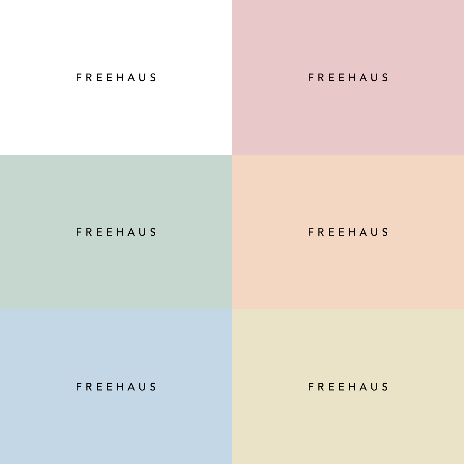
As part of the branding overhaul, a new logo was created alongside a new colour palette, font selection, website and branded materials such as business cards, reports and presentation templates.
SERVICES
Brand Identity, Web Design
CLIENT
Freehaus
TEAM
Branding and Web Design – Ana Bea Studio


