HAVERSTOCK
Redesigning a website to make an architecture practice's values visible
-
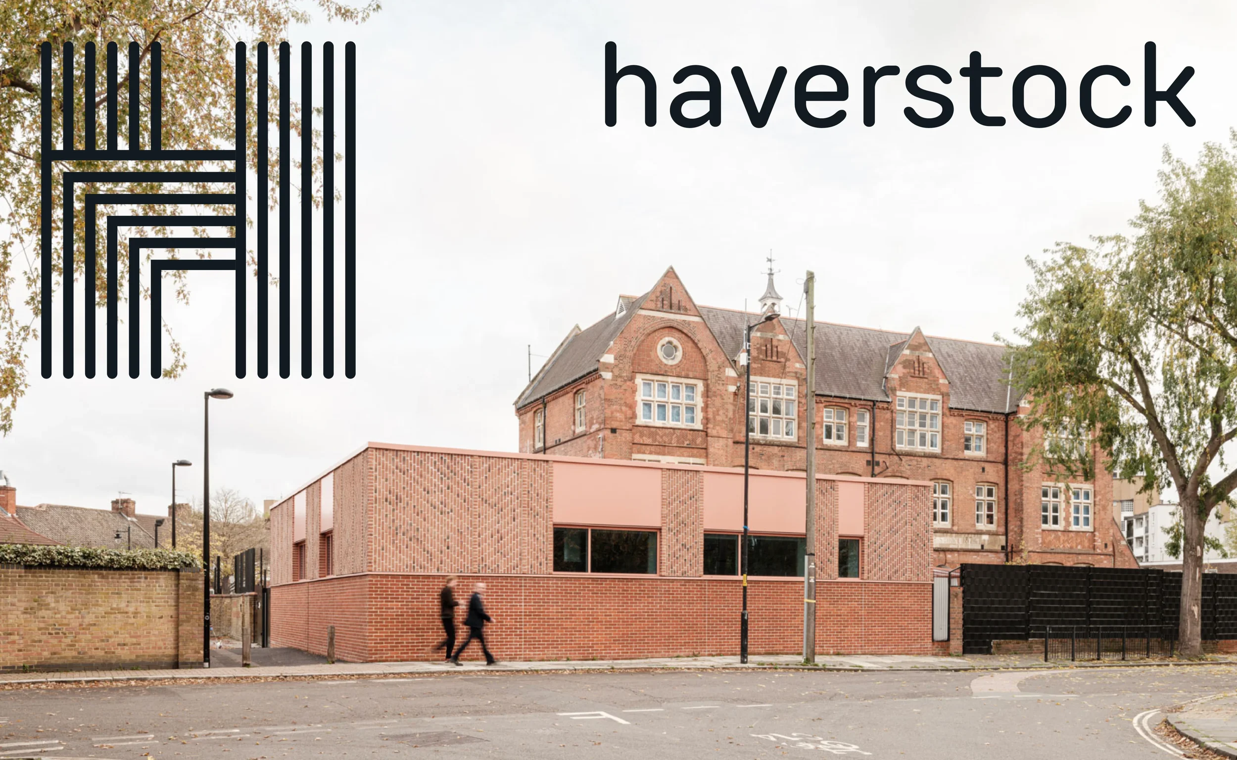
Haverstock is an award-winning architecture practice that puts people first. They see architecture as a collaborative and democratic process, giving the people who use their buildings a voice in shaping the places they inhabit.
Founded in 1980, Haverstock has built a strong reputation over four decades. While proud of its history and achievements, the practice felt that its brand identity and website no longer reflected its ethos, values or their ways or working.
Haverstock approached me to refine key aspects of their brand identity and completely redesign their website.
-
Accessibility, collaboration and democratic processes were recurring themes throughout our strategy sessions. These became the foundation for both the visual identity and the website experience. The challenge was not only to create a more accessible and intuitive website, but also to translate Haverstock's values into tangible design decisions.
Sometimes that meant making subtle changes with a meaningful impact. The wordmark was changed from title case to lowercase to create a more approachable identity. Team members are presented alphabetically rather than by seniority, reinforcing the practice's collaborative culture. These seemingly small decisions became consistent expressions of Haverstock's ethos.
Our research also revealed that the website needed to speak to two equally important audiences: prospective clients and future employees. Alongside showcasing Haverstock's projects and expertise, the website highlights the practice's studio culture, social value and the people behind the work.
The result is a digital experience where Haverstock's values are woven into every interaction, allowing collaboration, accessibility and democracy to be felt through the smallest details as well as the larger design decisions.
SERVICES
Brand Identity, Web Design
CLIENT
Haverstock
TEAM
Branding and Web Design – Ana Bea Studio


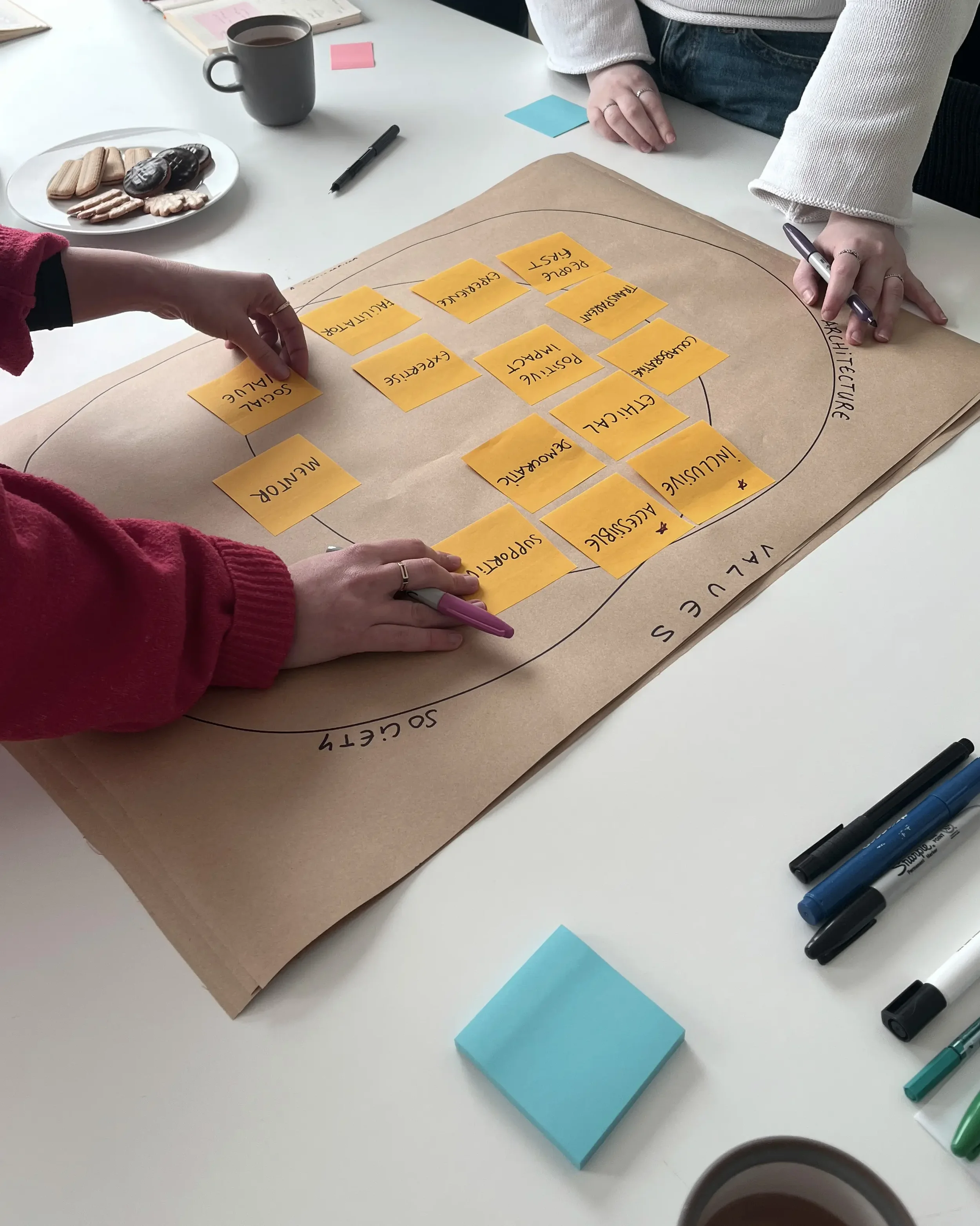
Research & Discovery workshop
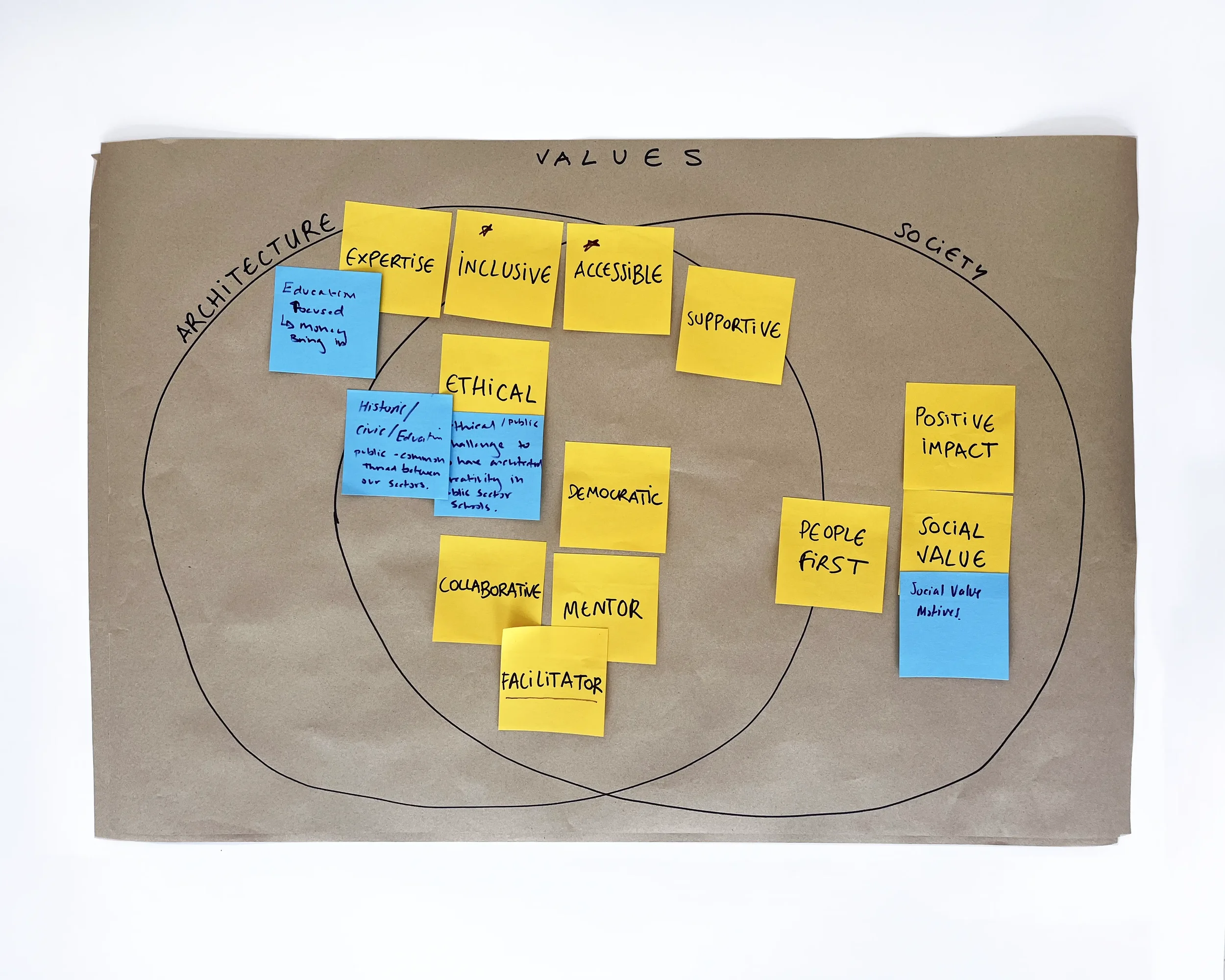
Values board co-created with the client
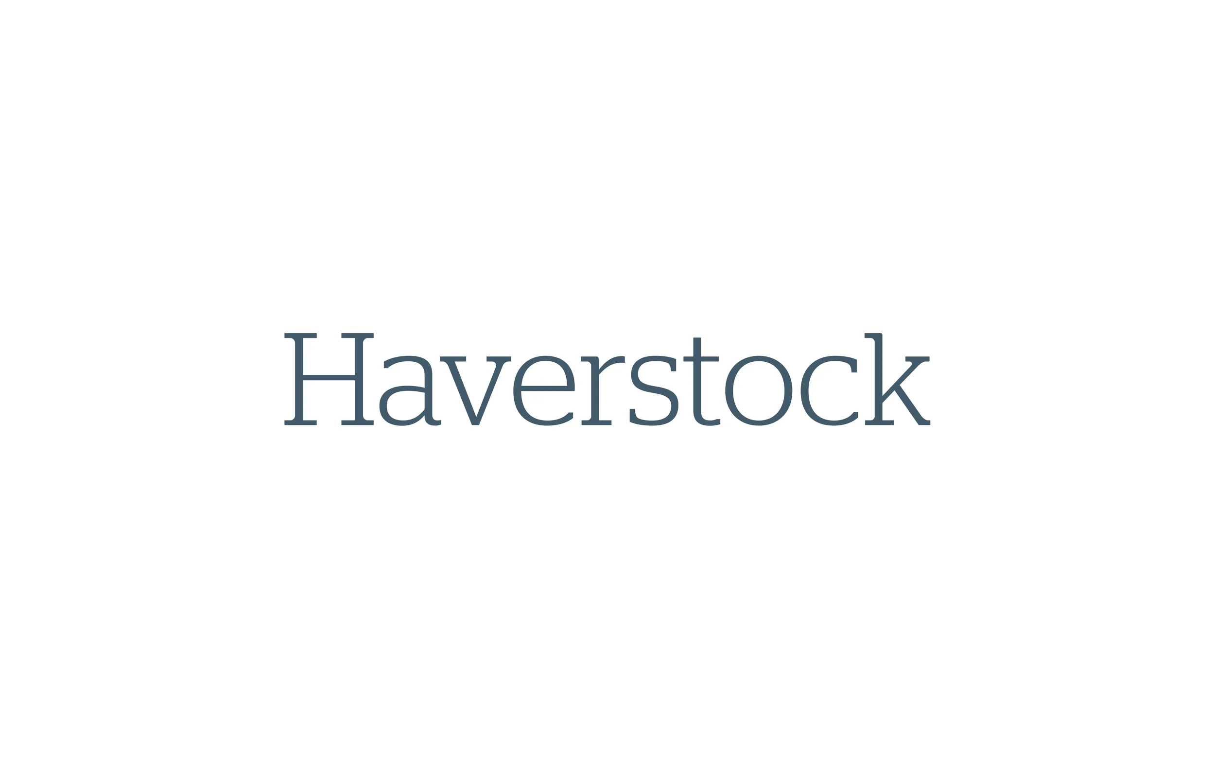
BEFOREPrevious wordmark

AFTERNew wordmark
“Ana Bea has been proactive in guiding us through the process, helping us establish our key messages and ensuring our website is user-friendly, accessible and refined, and demonstrates the best of our work and practice culture”
– GRACE BONHAM, COMMUNICATIONS & ADMINISTRATIVE COORDINATOR, HAVERSTOCK
“Our new website truly captures our practice and our ethos, enabling us to easily communicate our proud history, range of services and diverse work to our clients. ”
– GRACE BONHAM, COMMUNICATIONS & ADMINISTRATIVE COORDINATOR, HAVERSTOCK